Get In touch
Feel free to email me at hi@riteshr.com.np for counsuting work, and I'll get back to you.
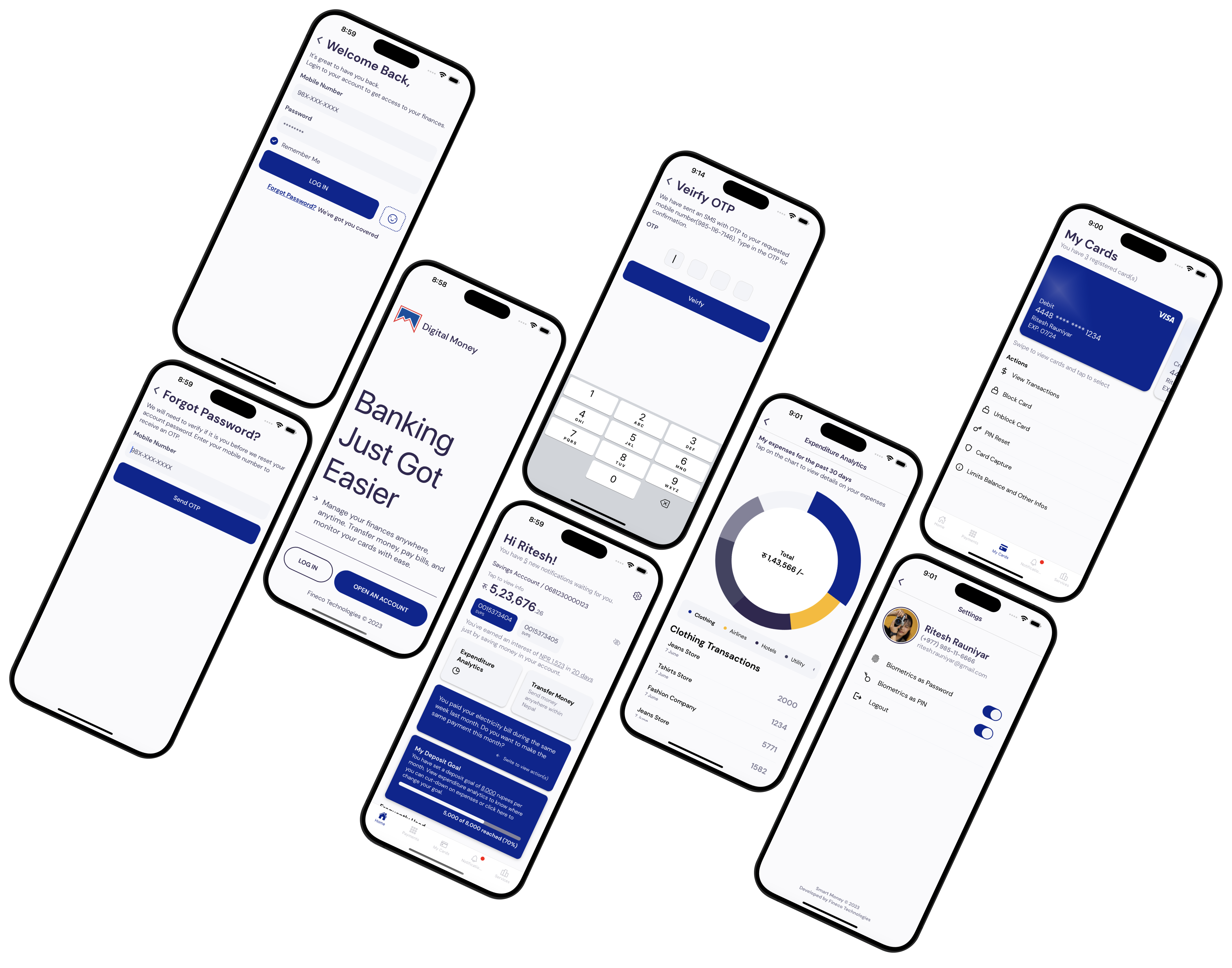
A complete mobile banking app interface designed in Figma for a financial institution, covering the end-to-end UI and UX of the customer-facing app — later used as the implementation reference for the React Native build.
The project was built to solve a problem common to most banking apps: the functionality of a banking app is inherently complex — accounts, transfers, statements, cards, security — but the experience of using it has to feel simple, fast, and trustworthy regardless of that complexity.
Mobile banking apps sit in a difficult spot for design. They need to support a wide range of financial functionality — checking balances, moving money, viewing statements, managing cards — much of which carries real consequences if a user gets confused or makes a mistake. At the same time, users expect a banking app to feel as fast and effortless as any other app on their phone, not like a form-heavy enterprise tool.
For the financial institution this was designed for, the goal wasn't just to make the app functional — it was to make sure the experience matched the level of trust a bank needs from its customers, while still feeling modern and easy to use day to day.
Without a deliberate design pass, banking apps tend to default to whatever structure is easiest to build rather than what's easiest to use — screens organized around backend systems instead of around what a customer is actually trying to do. This project set out to design the app around the customer's flow first, with implementation shaped around that.
The core challenge wasn't designing individual screens — it was designing a coherent system that could hold together across every flow a customer might use, while staying simple enough that none of the underlying complexity leaked into the experience.
This meant the design needed to:
In effect, the design needed to function less like a set of screen mockups and more like a blueprint — detailed and consistent enough that the engineering team could build directly from it with minimal reinterpretation.
I was responsible for the UI and UX design of the mobile banking app end to end, from early structure through to a implementation-ready Figma mockup.
My work included:
The key responsibility was making sure the design wasn't just visually polished, but structurally clear enough that "how should this work" was already answered by the mockup itself before development began.
Banking apps can't simplify by cutting features — the functionality has to stay complete. The design challenge was structuring that functionality so complexity was absorbed by the flow and hierarchy of the app, rather than by the user having to hold it in their head. That meant a lot of the actual design work happened in structure and sequencing, not just visual styling.
A misunderstood button on a shopping app is a minor annoyance. A misunderstood button on a transfer screen is a financial mistake. Every higher-stakes flow had to be designed so the user always knew exactly what would happen before they committed to an action — which meant deliberately over-communicating state and confirmation in places a purely aesthetic design pass might have trimmed down.
A mockup that looks good in Figma isn't automatically a mockup that translates cleanly into a working app. Keeping the React Native implementation in mind while designing meant thinking about component reuse, state variations, and consistent patterns from the start, so the handoff to development didn't require redesigning decisions that hadn't accounted for how the app would actually be built.
A banking app covers a lot of ground — accounts, transfers, statements, and more — and consistency tends to erode as more screens get added. Building around a shared design system rather than one-off screens was what kept the app feeling like one coherent product instead of a set of individually designed pages loosely connected by a navigation bar.
This project shifted how I think about the relationship between design and engineering. It's easy to treat a mockup as a picture of the end state and leave the "how does this actually work" questions for development to figure out. Here, the more valuable design work was in resolving those questions ahead of time — states, edge cases, and interaction logic — so the mockup wasn't just a visual target, it was closer to a specification.
For a financial product especially, I learned that good UX isn't about making things look simple — it's about doing the work to make genuinely complex functionality behave simply, without cutting corners on what the app actually needs to do. That's the standard I now bring to designing for financial products.
Feel free to email me at hi@riteshr.com.np for counsuting work, and I'll get back to you.